Ruben Pater
Bio
Under the name Untold Stories, Ruben Pater creates visual narratives that support solidarity, justice, and equality. The aim is to reach a wide audience through images, printed media, interactive media, and film. His “Drone Survival Guide” (2013) received worldwide attention as a discussion piece on military drones. In his book “The Politics of Design” (BIS, 2016) he looks at the responsabilities of designers in visual culture. His last book “CAPS LOCK” (Valiz, 2021) is a reference work that uses clear language and visual examples to show how graphic design and capitalism have come to be inextricably linked. Pater teaches at both the master and the bachelor progammes in the Graphic Design Department at the Royal Academy of Art in The Hague.A discussion on CAPS LOCK
In the context of the lectures, I will talk about my most recent book, CAPS LOCK. This is my second book; the first one was called The Politics of Design. I don’t really consider myself a writer — I’m a graphic designer, and was trained as such. When I was working for studios, I wanted to use that experience not just for cultural clients, but for multinationals, for governments. I worked for McDonald’s, for KPMG, in the advertising industry. That kind of experience shaped my idea of design: a lot of the concepts in these two books are based on my own work paired with theoretical context. Then I started to write because I wanted these books to be there — I was looking for books about cultural differences, sexism and racism in relation to graphic design and could not find them, so I decided to write it from my own perspective.
In my first book The Politics of Design I was mostly using sources from anthropology and cultural studies from the sixties and seventies. I wanted to translate this kind of theory — that was already present in cultural studies — for designers that are not necessarily academically trained, and to translate this with visual examples. In my second book, CAPS LOCK, I mostly address the role of capitalism within graphic design, a topic that I didn’t handle in my first book. This decision could be considered curious because that book talks about politics, but it was made because I didn’t know if it was possible to resolve that kind of question — it’s such a complex relationship. A common thought of graphic designers and designers in large nowadays is “there’s no ethical design possible under capitalism”. A question emerges: how can we even practise design outside of this market that created design in the first place? I thought it was so important to answer this because, if you’re looking for a more ethical practice, you have to face this question one way or the other.
I started to research in order to write CAPS LOCK about four years ago, but I did not know if it was going to be successful. Writing is something I do on the side, because I think this relationship between reflection and making — and also teaching in my case — also keeps me interested in different topics and sharpens my idea on design. As we said, it is difficult to address the broader concept of capitalism and graphic design. To solve that, I used my skills as a graphic designer to create a form of navigation that allows me to use my own trajectory to address the concept — as a young designer visiting art school, working for corporations, and working for clients. To tackle this, I decided to employ a navigational framework that uses my own journey through the design landscape as a means to explore this concept. What struck me was noticing how the roles we assume in this field can shift dramatically according to the activity the designer has to do. At times, we are “engineers” meticulously crafting typography and refining layouts. Then we transform into “salesmen” tasked with convincing clients and bosses that our design is the one to go with — no second chances. Sometimes, we even find ourselves negotiating for better compensation. In this context, I wanted to use all of these distinct roles to offer different angles into the topic, which allowed me to navigate the complex field without being necessarily complete.
There may be a little bit about the personal backstory and reasons why I wrote this book — but I believe that it is a common necessity to address these topics. This is not some sort of luxury position of dreaming of a better world: this is a necessity with the inequality that we are facing right now. In the last decades we’ve witnessed a troubling trend of increasing hunger across the globe. Our world is grappling with a rising chasm of inequality, where a mere 2.000 billionaires possess more wealth than over 60% of the world’s population combined. Additionally, the looming climate crisis is a stark reminder of the ecological challenges we face, and the burden of the climate crisis falls on those who consume the most and produce the most, which is also Europeans. As a person from Europe, from the Netherlands, it’s also my own responsibility to address this urgent issue of the climate crisis and degrowth because despite all the climate summons we recently had, the global emissions are far from going down. This is a difficult topic, but in the end, it’s also not possible to keep doing what we’re doing — this is the main message. If we continue, we will probably self-destruct through climate crises. And we know the people in the world who are going to pay for that are going to be the people who have the least money and who are in the most dire or precarious circumstances. We can say that this is the starting context for addressing the relationship between graphic design and capitalism.
The first chapter is called The Designer As Scribe. The scribe is the role of what designers had before printing existed — which was, for example, the monk that was writing by hand, or maybe making clay tablets. I think scribes are also interesting because they created a form of computation. If we talk about the context of the network society, we can connect the idea of the scribe to the beginning of computation. In fact, the first graphic documents ever found, are not for poetry or prose: they’re receipts. So, before there was route writing, there was accounting. Historical sources say that one of the first forms of writings — the cuneiform writing from Mesopotamia used about 5.000 years ago — was not for telling stories, but for keeping track of trades. It started with numbers and symbols for oxes, grain and commodities, it has an economic origin.  Clay tablet of the Mesopotamian civilization, 3100 B.C. - 3000 B.C. These clay tablets where the accounting was made were small, about nine and a half centimetres by seven — that means that the scribes were extremely skilled to do their job. There were a few people that were educated in Mesopotamia, and we can see that the consistency of the mark making shows a tremendous skill, which regarded both tracing and pressing.
The clay tables are one of the firsts examples where the economic transactions needed some form of trusted written document: it was the beginning of the city-state, with cities with millions people at their peak. Growing population growth thus led to structural changes in society and in relationships with individuals. If we’re in a small community we don’t need to keep a track of our trades because know each other. This is how the economy had functioned for such a long time without money, because people just kept track of credits by memory and there was social trust: that was the basis of economic relations. But if you have a city of millions, you need some kind of mediation because you don’t know all the people and therefore you need a form of trust. That form of trust came about in the form of written documents: some of the first graphic documents were actually necessary to mediate economic relations.
Later in time, trust in the economy was also provided by the State: the banknotes are one of the tangible examples. In fact, the function of these written documents is also to have an official appearance, which can convey confidence in the whole system: this is supported by printing, stamps, autographs, ornaments, and the use of a specific type of paper. Alle these characteristics are graphic technologies that designers and printers could manufacture through their craft. We still have this system in banknotes: even today, all of the technologies are not only meant to prevent counterfeiting, but also meant to create trust in the document. This underlines the critical role graphic designers play in creating documents that help establish trust in an economic system — that is, in the end, underpinned by the State, supported by the military and police.
Looking back to the colonial era, we can see another example which regards the first stock exchange in the Netherlands — that was, of course, for colonial trade. These exploitative journeys were so risky that they could not be funded by the State alone: that’s why stock was issued. Many people, mostly merchants that had become wealthy through the trade in local regions of Germany, Poland, and the Baltic Sea area, could use those riches to buy stock and then invest in these journeys. What you see here is one of the first financial newspaper from the Dutch Stock Exchange.
Clay tablet of the Mesopotamian civilization, 3100 B.C. - 3000 B.C. These clay tablets where the accounting was made were small, about nine and a half centimetres by seven — that means that the scribes were extremely skilled to do their job. There were a few people that were educated in Mesopotamia, and we can see that the consistency of the mark making shows a tremendous skill, which regarded both tracing and pressing.
The clay tables are one of the firsts examples where the economic transactions needed some form of trusted written document: it was the beginning of the city-state, with cities with millions people at their peak. Growing population growth thus led to structural changes in society and in relationships with individuals. If we’re in a small community we don’t need to keep a track of our trades because know each other. This is how the economy had functioned for such a long time without money, because people just kept track of credits by memory and there was social trust: that was the basis of economic relations. But if you have a city of millions, you need some kind of mediation because you don’t know all the people and therefore you need a form of trust. That form of trust came about in the form of written documents: some of the first graphic documents were actually necessary to mediate economic relations.
Later in time, trust in the economy was also provided by the State: the banknotes are one of the tangible examples. In fact, the function of these written documents is also to have an official appearance, which can convey confidence in the whole system: this is supported by printing, stamps, autographs, ornaments, and the use of a specific type of paper. Alle these characteristics are graphic technologies that designers and printers could manufacture through their craft. We still have this system in banknotes: even today, all of the technologies are not only meant to prevent counterfeiting, but also meant to create trust in the document. This underlines the critical role graphic designers play in creating documents that help establish trust in an economic system — that is, in the end, underpinned by the State, supported by the military and police.
Looking back to the colonial era, we can see another example which regards the first stock exchange in the Netherlands — that was, of course, for colonial trade. These exploitative journeys were so risky that they could not be funded by the State alone: that’s why stock was issued. Many people, mostly merchants that had become wealthy through the trade in local regions of Germany, Poland, and the Baltic Sea area, could use those riches to buy stock and then invest in these journeys. What you see here is one of the first financial newspaper from the Dutch Stock Exchange. 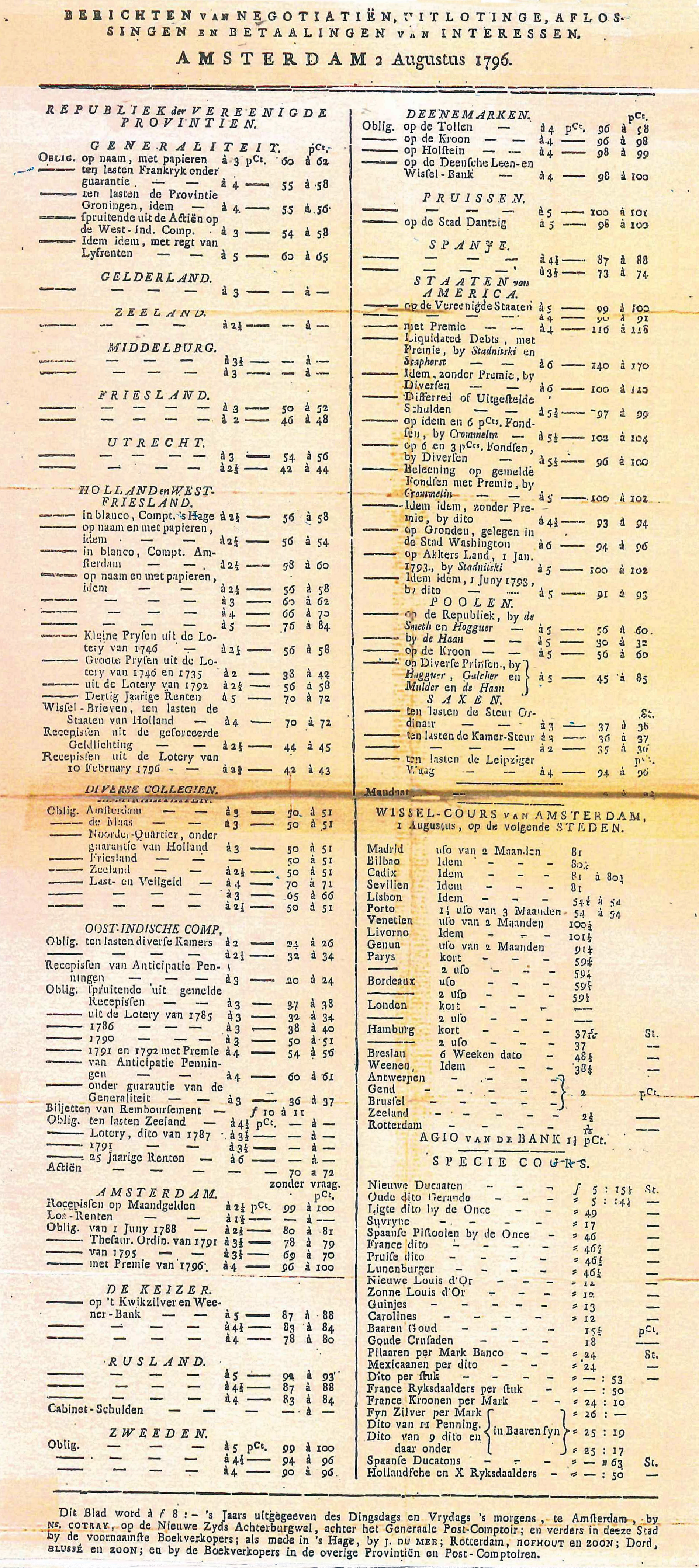 The First Price List, Nicolaas Cotray, 1796. We can see that the notation of the stock, the value of all these things that they expected to, come from the colonies. The news about shipping was the most important of the day. The first newspapers basically communicated only the news about shipping because that allowed investors to trade their stock according to what was happening in that specific period. The interesting thing is that the language of the first kind of financial newspaper is quite similar to the ones of today. There’s still a visual language with typography organised by lines and by resources, which is the way we discuss economy today. This is mostly what a designer has to do when they have to design an annual report: there is the excel sheet and they have to create the whole form and infographics, which is another topic on visualizing the economy.
 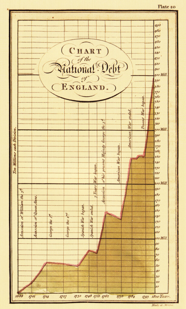 England’s national debt 1668-1800, William Playfair
This image is made by William Playfair. He is considered the inventor of specific visualisations such as the bar chart and the pie chart. He was from Scotland, and was not a graphic designer nor an artist, but an economist and an engineer. In fact, his first infographics were used to communicate information about the economy of England. We can notice that the first infographics were used for scientific purposes, again in the Renaissance era, but the invention of many of these methods for economic and mathematical purposes from the Industrial era made the use of infographics systematic. We need that language, we need a language of mathematical notation to understand complex processes and keep track of diverse elements. But, when considering the economy, it becomes evident that viewing the world only through the lens of a stock trader often reduces it to a realm of mathematics, numbers, profits, and losses. However, it’s crucial to recognize that each number conceals a broader reality — a family, a home, a piece of forest destroyed, or perhaps a generational farm changing hands. These numerical aspects are intimately connected to the social conditions within the economy.
An economy is, in its essence, a social process. The word “economy” itself originates from the Greek term for a domestic environment, encompassing the organisation of a household (ndr. dal greco oikos, “casa” inteso anche come “beni di famiglia”, e nomos “norma” o “legge”). It reflects the act of people transforming resources from nature into something new. Yet, within the field of economics, we tend to overlook this essential social dimension, prioritising mathematical abstraction. By losing the social aspect, we lose some of that sensitivity to what it can mean. Consider the 2008 financial crisis, for instance, which had a significant mortgage crisis component. In the United States, countless individuals lost their homes due to unaffordable mortgages. Entire streets witnessed the eviction of families, leaving houses vacant. Meanwhile, people resorted to sleeping in their cars and on the streets, while these homes were eventually bought up by investors who held onto them, waiting for their values to be reassessed. This starkly illustrates how divorcing economics from its social roots can obscure the profound human implications of economic events.
In a small community, instead, we would never do that because it would make no sense. But in the capitalist system, where property is of course most more important than a “roof”, this makes complete sense. In this system, legal ownership grants individuals the authority to utilise their property without regard for broader circumstances.Consider, for example, a piece of rainforest — an invaluable contributor to our well-being and the sustenance of life. From an economic perspective, it is deemed valueless. It’s only when we clear it and replace it with a palm oil plantation that it acquires economic worth. This perspective, rooted in monetary valuation and often measured by metrics like GDP, could lead to the perverse and paradoxical conclusion that it’s advantageous to clear every rainforest worldwide for uses such as palm oil plantations or even parking lots.
The prevalence of this perspective is also related to the way that we communicate economic information as designers, even if the issue it is much bigger than design itself. There are various examples which show that we can act differently. This is a nice example from Gapminder, an NGO in Sweden that deals with statistics for a large audience, who created the website Dollar Street.
England’s national debt 1668-1800, William Playfair
This image is made by William Playfair. He is considered the inventor of specific visualisations such as the bar chart and the pie chart. He was from Scotland, and was not a graphic designer nor an artist, but an economist and an engineer. In fact, his first infographics were used to communicate information about the economy of England. We can notice that the first infographics were used for scientific purposes, again in the Renaissance era, but the invention of many of these methods for economic and mathematical purposes from the Industrial era made the use of infographics systematic. We need that language, we need a language of mathematical notation to understand complex processes and keep track of diverse elements. But, when considering the economy, it becomes evident that viewing the world only through the lens of a stock trader often reduces it to a realm of mathematics, numbers, profits, and losses. However, it’s crucial to recognize that each number conceals a broader reality — a family, a home, a piece of forest destroyed, or perhaps a generational farm changing hands. These numerical aspects are intimately connected to the social conditions within the economy.
An economy is, in its essence, a social process. The word “economy” itself originates from the Greek term for a domestic environment, encompassing the organisation of a household (ndr. dal greco oikos, “casa” inteso anche come “beni di famiglia”, e nomos “norma” o “legge”). It reflects the act of people transforming resources from nature into something new. Yet, within the field of economics, we tend to overlook this essential social dimension, prioritising mathematical abstraction. By losing the social aspect, we lose some of that sensitivity to what it can mean. Consider the 2008 financial crisis, for instance, which had a significant mortgage crisis component. In the United States, countless individuals lost their homes due to unaffordable mortgages. Entire streets witnessed the eviction of families, leaving houses vacant. Meanwhile, people resorted to sleeping in their cars and on the streets, while these homes were eventually bought up by investors who held onto them, waiting for their values to be reassessed. This starkly illustrates how divorcing economics from its social roots can obscure the profound human implications of economic events.
In a small community, instead, we would never do that because it would make no sense. But in the capitalist system, where property is of course most more important than a “roof”, this makes complete sense. In this system, legal ownership grants individuals the authority to utilise their property without regard for broader circumstances.Consider, for example, a piece of rainforest — an invaluable contributor to our well-being and the sustenance of life. From an economic perspective, it is deemed valueless. It’s only when we clear it and replace it with a palm oil plantation that it acquires economic worth. This perspective, rooted in monetary valuation and often measured by metrics like GDP, could lead to the perverse and paradoxical conclusion that it’s advantageous to clear every rainforest worldwide for uses such as palm oil plantations or even parking lots.
The prevalence of this perspective is also related to the way that we communicate economic information as designers, even if the issue it is much bigger than design itself. There are various examples which show that we can act differently. This is a nice example from Gapminder, an NGO in Sweden that deals with statistics for a large audience, who created the website Dollar Street. 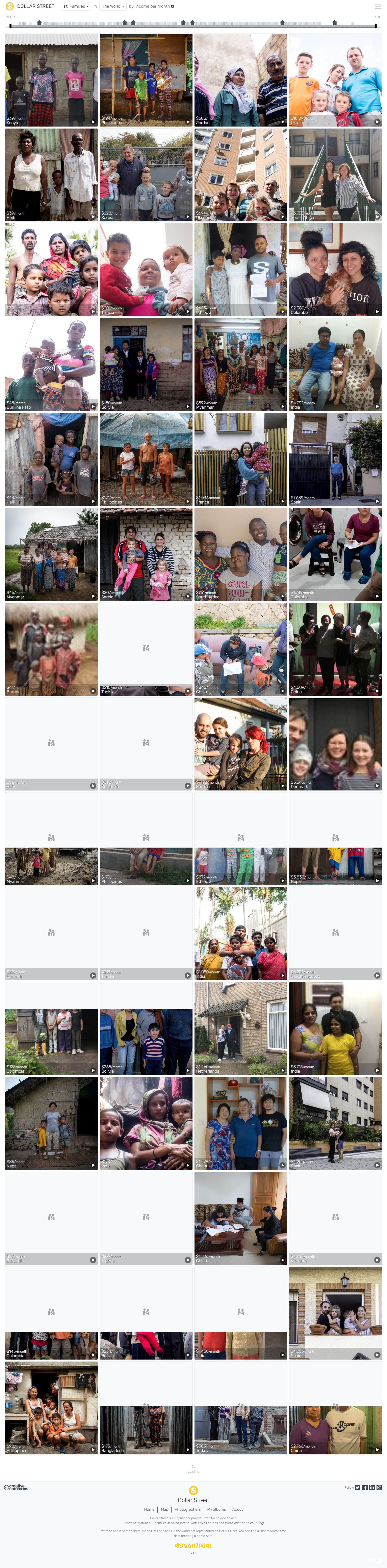 Home page of Dollar Street, 2023.
They want to question the mathematical nature of statistics and provide social context to do so. It’s a comparison of income in the world, where I don’t just see the family income as a number of all these different countries; I also see their dog, I see them cooking. There are movies on the website where you see the family hanging around in the house and you realise it becomes much more difficult or even impossible to compare incomes. If I see only the incomes on the spreadsheet, I will have a very different relationship to those people than I have now when I see their life. I think this is precisely the kind of social context that design sometimes lacks, or that we can kind of familiarise ourselves with. Thanks to the example we’ve seen before, we can realise how this also deals with computation, the way that society is organised; because through the language of computation, we create networks and we build information that works in a similar way.
The second chapter that we will discuss is about the work of designers and it is entitled Designer as brander. What I’ve done for most of my career is branding. Much of the work that designers do today is based on that, precisely because branding is the majority of the work that comes from the marketplace where we are asked to create objects for the market or create demand for it. The concepts of selling, buying, and establishing markets are not exclusive to capitalism. This is a point of contention I encounter frequently: why is my book not free? The answer lies in the fact that it took four years of dedicated work, involved the efforts of a printer, and required the resources of a publisher who invested their time. Should they not be compensated for their contributions? The belief that buying and selling are inherently capitalist actions is, in fact, misleading. The existence of markets predates capitalism. However, what matters is the role that markets assume in society.
An example could be the one of the supermarkets, which are a very recent invention. In the period before the Industrial Revolution, a significant portion of the population had access to land and could grow their own food. They produced many of the items they consumed and traded the surplus with feudal lords or acquired other necessities from markets. This dynamic was fundamentally different from our present day reliance on supermarkets. Today the small markets and groceries stores have become a small phenomenon in the community, and now we have to buy everything at the supermarket because almost none of us have access to a piece of land and we can’t grow our own food or create our own objects. The supermarket became an important place where we have to go for everything. This space is of course a major victory of capitalism. First of all, it’s about convenience: I don’t have to go to the bakery, to the butcher, or to the vegetable shop; I can get everything at the same place. Then there’s also the idea of the abundance of products. In communism, famously, we saw the lines of people in front of the shop where there was only one type of bread available. However, behind those services there are, of course, branding strategies. For instance, we don’t see that only 2% of products in supermarkets on average are regional or local. We rarely wonder how they manage to maintain a consistent supply, even when seasonal factors come into play. Supermarkets create an illusion that time is no longer an issue in agriculture.
Additionally, the branding landscape, particularly in Europe, is heavily influenced by a select few major players. This exerts pressure not only on farmers but also on supermarkets. For example, in the Netherlands, despite having apples, pears, and cherries locally, supermarkets always feature apples from as far away as South Africa and New Zealand. This begs the question: why import apples from New Zealand to the Netherlands when local options are readily available? The answer lies in complex market dynamics, where manufacturers often bundle their products. For instance, a kiwi manufacturer might demand that supermarkets purchase their apples alongside their kiwis. These intricate market mechanisms, together with pressures for monopolies, force supermarkets to carry products that, from an environmentally responsible perspective, seem completely irrational to sell. It’s important to note that many of these companies, seemingly offering a wide array of products, are, in reality, controlled by just a few corporations competing within the same market segment.
Home page of Dollar Street, 2023.
They want to question the mathematical nature of statistics and provide social context to do so. It’s a comparison of income in the world, where I don’t just see the family income as a number of all these different countries; I also see their dog, I see them cooking. There are movies on the website where you see the family hanging around in the house and you realise it becomes much more difficult or even impossible to compare incomes. If I see only the incomes on the spreadsheet, I will have a very different relationship to those people than I have now when I see their life. I think this is precisely the kind of social context that design sometimes lacks, or that we can kind of familiarise ourselves with. Thanks to the example we’ve seen before, we can realise how this also deals with computation, the way that society is organised; because through the language of computation, we create networks and we build information that works in a similar way.
The second chapter that we will discuss is about the work of designers and it is entitled Designer as brander. What I’ve done for most of my career is branding. Much of the work that designers do today is based on that, precisely because branding is the majority of the work that comes from the marketplace where we are asked to create objects for the market or create demand for it. The concepts of selling, buying, and establishing markets are not exclusive to capitalism. This is a point of contention I encounter frequently: why is my book not free? The answer lies in the fact that it took four years of dedicated work, involved the efforts of a printer, and required the resources of a publisher who invested their time. Should they not be compensated for their contributions? The belief that buying and selling are inherently capitalist actions is, in fact, misleading. The existence of markets predates capitalism. However, what matters is the role that markets assume in society.
An example could be the one of the supermarkets, which are a very recent invention. In the period before the Industrial Revolution, a significant portion of the population had access to land and could grow their own food. They produced many of the items they consumed and traded the surplus with feudal lords or acquired other necessities from markets. This dynamic was fundamentally different from our present day reliance on supermarkets. Today the small markets and groceries stores have become a small phenomenon in the community, and now we have to buy everything at the supermarket because almost none of us have access to a piece of land and we can’t grow our own food or create our own objects. The supermarket became an important place where we have to go for everything. This space is of course a major victory of capitalism. First of all, it’s about convenience: I don’t have to go to the bakery, to the butcher, or to the vegetable shop; I can get everything at the same place. Then there’s also the idea of the abundance of products. In communism, famously, we saw the lines of people in front of the shop where there was only one type of bread available. However, behind those services there are, of course, branding strategies. For instance, we don’t see that only 2% of products in supermarkets on average are regional or local. We rarely wonder how they manage to maintain a consistent supply, even when seasonal factors come into play. Supermarkets create an illusion that time is no longer an issue in agriculture.
Additionally, the branding landscape, particularly in Europe, is heavily influenced by a select few major players. This exerts pressure not only on farmers but also on supermarkets. For example, in the Netherlands, despite having apples, pears, and cherries locally, supermarkets always feature apples from as far away as South Africa and New Zealand. This begs the question: why import apples from New Zealand to the Netherlands when local options are readily available? The answer lies in complex market dynamics, where manufacturers often bundle their products. For instance, a kiwi manufacturer might demand that supermarkets purchase their apples alongside their kiwis. These intricate market mechanisms, together with pressures for monopolies, force supermarkets to carry products that, from an environmentally responsible perspective, seem completely irrational to sell. It’s important to note that many of these companies, seemingly offering a wide array of products, are, in reality, controlled by just a few corporations competing within the same market segment. 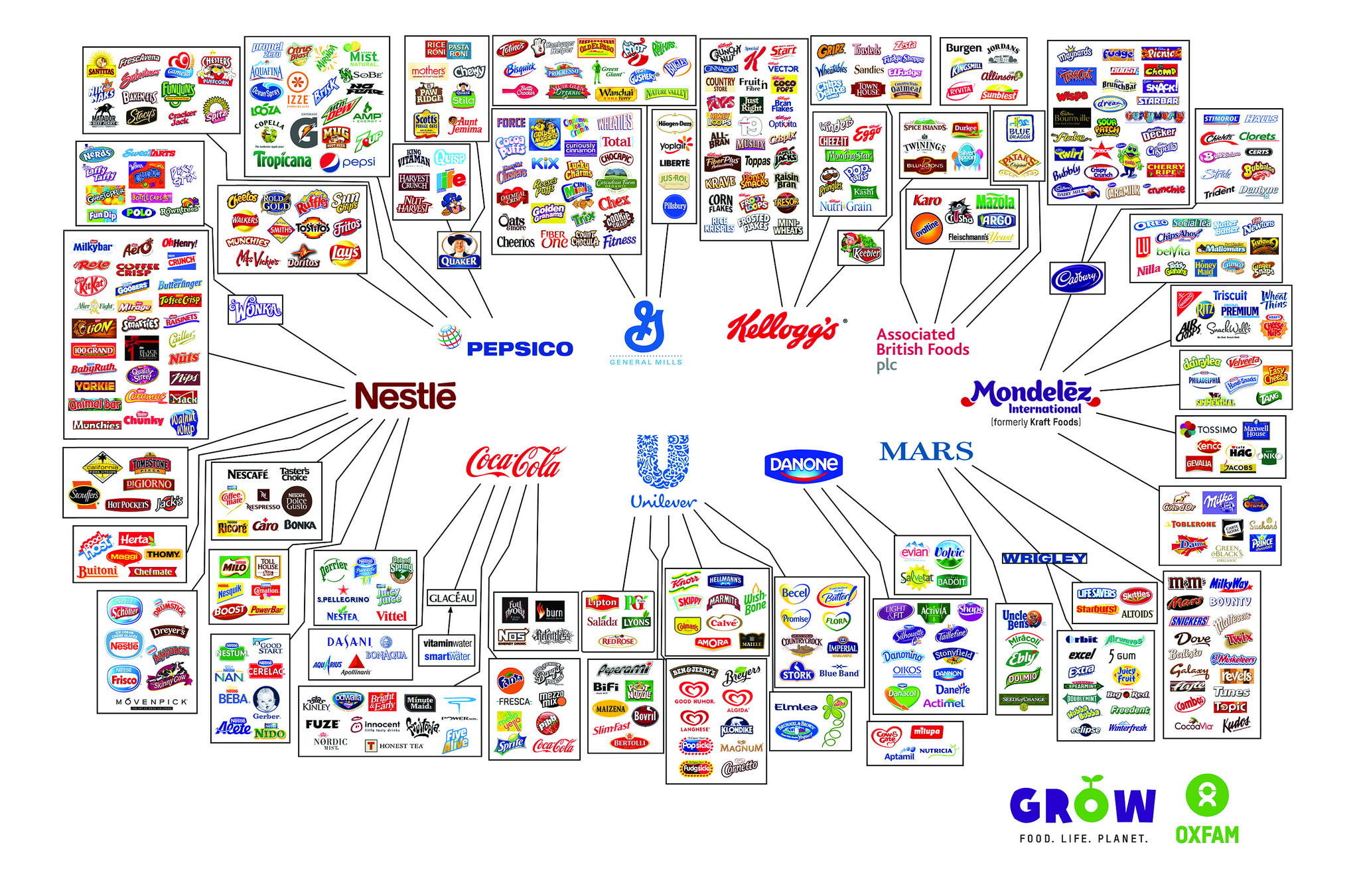 Monopolies of the food industry.
I worked at a factory specialising in soap production, specifically detergents for household cleaning. My role involved the production of the bottles used for packaging. Interestingly, in the section where the bottles were filled, the containers remained identical, while different logos were affixed to them. This often resulted in identical products packaged in various ways. It emphasises how the label and the brand play a pivotal role in shaping the perception of value. It’s not just what’s inside, it’s mostly what is created from our imagination. The evolution of brands since the the nineties underscores this transformation, as they have completely superseded their role of use value. There’s nothing inherently wrong with labelling a product or taking pride in its origin, such as a Venetian product bearing a logo that represents family heritage; that’s commendable. However, companies like Apple and Nike have realised that the brand itself, the design, can dramatically inflate the perceived value. Apple, for instance, has risen to become the world’s most valuable company, primarily driven by marketing and branding. Even corporations like Google and Facebook have shifted away from physical product manufacturing, further highlighting the dominance of branding in the modern market. What they create is services, digital products, immaterial labour, but they can become extremely valuable. The idea of brand value is very tangible. Brands like Apple become a kind of religion where things can be ludicrously expensive just based on the idea of value that we, as designers, created — that’s our job. Phil Knight, ex-CEO of Nike, during an interview admitted that they don’t “make shoes” or “clothing”. What they create is a brand: the most important part of the production is the intellectual property, the designs and ideas.
It’s also important to talk about the history of the word “branding”, which of course comes from the act of branding animals as a sign of ownership.
Monopolies of the food industry.
I worked at a factory specialising in soap production, specifically detergents for household cleaning. My role involved the production of the bottles used for packaging. Interestingly, in the section where the bottles were filled, the containers remained identical, while different logos were affixed to them. This often resulted in identical products packaged in various ways. It emphasises how the label and the brand play a pivotal role in shaping the perception of value. It’s not just what’s inside, it’s mostly what is created from our imagination. The evolution of brands since the the nineties underscores this transformation, as they have completely superseded their role of use value. There’s nothing inherently wrong with labelling a product or taking pride in its origin, such as a Venetian product bearing a logo that represents family heritage; that’s commendable. However, companies like Apple and Nike have realised that the brand itself, the design, can dramatically inflate the perceived value. Apple, for instance, has risen to become the world’s most valuable company, primarily driven by marketing and branding. Even corporations like Google and Facebook have shifted away from physical product manufacturing, further highlighting the dominance of branding in the modern market. What they create is services, digital products, immaterial labour, but they can become extremely valuable. The idea of brand value is very tangible. Brands like Apple become a kind of religion where things can be ludicrously expensive just based on the idea of value that we, as designers, created — that’s our job. Phil Knight, ex-CEO of Nike, during an interview admitted that they don’t “make shoes” or “clothing”. What they create is a brand: the most important part of the production is the intellectual property, the designs and ideas.
It’s also important to talk about the history of the word “branding”, which of course comes from the act of branding animals as a sign of ownership. 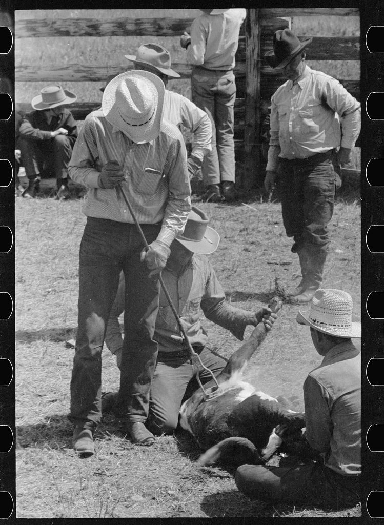 Branding calf. Three Circle roundup, Arthur Rothstein, 1939. Of course this did not only happen with animals, but also with slaves. They were branded with the currency of their country, so people could buy their freedom. During colonial times, this was a real industrial skill — the Dutch were actually big in slave trades and even had books that explained how to do branding and what letters had to be used. This is a very violent and problematic part of design history. This is an image by the artist Hank Willis Thomas.
  Scarred Chest, Hank Willis Thomas, 2003. What we can learn from this image is what the act of branding does in times of slavery: it was a form of torture. Through this mechanism of torture, the trader turned a human being into a commodity, into a slave who has no rights. This logic is really deeply ingrained in capitalism.
In this context, the power of design and branding comes into play. Designers have the ability to take something that should be a fundamental human right, such as access to water, housing, or even air, and transform it into a luxurious and expensive commodity. Consider, for instance, if I were to pour the same water into a plain bottle and tell you it costs 80 euros, you might be sceptical. However, when presented with a bottle adorned with glitters and other embellishments, displayed in a high-end shop, suddenly the idea becomes more believable. Graphic designers and product designers are well-versed in the art of creating value and conveying the perception of worth. This extends to understanding the visual cues that define the value of various items, such as what makes a piece of clothing appear expensive and how visual elements can be harnessed to enhance the perceived value of a product, ultimately influencing consumer choices.
With city branding, it’s similar — I think Venice is also an interesting case, although differently. How do you sell a city? In my own city, Amsterdam, this was really problematic. In Amsterdam, the relationship between city branding, real estate sales, and the arrival of platforms like Airbnb has led to the development of a city that’s become unlivable, where even essential workers like teachers and healthcare professionals can no longer afford housing. I once believed that these city logos were designed with the city’s residents in mind. However, it’s become clear that they aren’t. This is exemplified by logos in cities like Berlin, Lyon, and Amsterdam, all of which use English, a language not spoken natively by the majority of their residents: that’s because these logos aren’t intended for the local population. Cities like Amsterdam or Berlin possess an inherent richness of culture and identity, making city branding unnecessary from a local perspective. You brand a city in order to sell it; that’s the whole logic. In Amsterdam’s case, the objective was to attract different kinds of tourists — the ones willing to spend money on museums and cultural experiences, others willing to spend on the weed market… At the same time, there was a push to sell real estate to foreign buyers. This approach had significant consequences, notably illustrated by the placement of a large logo in front of the Rijksmuseum Museum. Fast forward a decade or so, and we’ve witnessed a doubling in homelessness in Amsterdam, together with an overall housing market that’s beyond the reach of many residents. This logic shows us really clearly the strains of logic in capitalism: what happens if you turn something into a market? There’s a lot of these cases about how the privatisation of something that should be a public good creates strange relationships about how to survive, even how to live, how to breathe.
This is at the core of my book.
Scarred Chest, Hank Willis Thomas, 2003. What we can learn from this image is what the act of branding does in times of slavery: it was a form of torture. Through this mechanism of torture, the trader turned a human being into a commodity, into a slave who has no rights. This logic is really deeply ingrained in capitalism.
In this context, the power of design and branding comes into play. Designers have the ability to take something that should be a fundamental human right, such as access to water, housing, or even air, and transform it into a luxurious and expensive commodity. Consider, for instance, if I were to pour the same water into a plain bottle and tell you it costs 80 euros, you might be sceptical. However, when presented with a bottle adorned with glitters and other embellishments, displayed in a high-end shop, suddenly the idea becomes more believable. Graphic designers and product designers are well-versed in the art of creating value and conveying the perception of worth. This extends to understanding the visual cues that define the value of various items, such as what makes a piece of clothing appear expensive and how visual elements can be harnessed to enhance the perceived value of a product, ultimately influencing consumer choices.
With city branding, it’s similar — I think Venice is also an interesting case, although differently. How do you sell a city? In my own city, Amsterdam, this was really problematic. In Amsterdam, the relationship between city branding, real estate sales, and the arrival of platforms like Airbnb has led to the development of a city that’s become unlivable, where even essential workers like teachers and healthcare professionals can no longer afford housing. I once believed that these city logos were designed with the city’s residents in mind. However, it’s become clear that they aren’t. This is exemplified by logos in cities like Berlin, Lyon, and Amsterdam, all of which use English, a language not spoken natively by the majority of their residents: that’s because these logos aren’t intended for the local population. Cities like Amsterdam or Berlin possess an inherent richness of culture and identity, making city branding unnecessary from a local perspective. You brand a city in order to sell it; that’s the whole logic. In Amsterdam’s case, the objective was to attract different kinds of tourists — the ones willing to spend money on museums and cultural experiences, others willing to spend on the weed market… At the same time, there was a push to sell real estate to foreign buyers. This approach had significant consequences, notably illustrated by the placement of a large logo in front of the Rijksmuseum Museum. Fast forward a decade or so, and we’ve witnessed a doubling in homelessness in Amsterdam, together with an overall housing market that’s beyond the reach of many residents. This logic shows us really clearly the strains of logic in capitalism: what happens if you turn something into a market? There’s a lot of these cases about how the privatisation of something that should be a public good creates strange relationships about how to survive, even how to live, how to breathe.
This is at the core of my book.  Apple patent for facial recognition, 2019. This is a patent by Apple computer where they use the face recognition in the iPhone to read your mood, with a semantic analysis. They look at your eyes, your nose, your face, and they can see if you are sad, happy or excited; creating a way to quantify your emotions. Therefore, when you’re on Facebook or Instagram and you’re scrolling, it can detect whether you like this post or not: and that is a way to profit from your emotions without you even knowing. The user is being exploited or their behaviour is being monitored — these are like highly technical ways, which the writer Shoshana Zuboff writes about in Surveillance capitalism; and they are really highly automated and complex ways of exploitation, very difficult for us to comprehend. Many of these drawings are just patents, they’re not necessarily already being used, but it’s a way of being ahead of the curve. These methods of advertising and exploitation go way beyond the idea of “branding”, because they directly try to commodify our behaviour without us even being aware of it. This aspect adds an intriguing layer to the discussion, and emphasises how the capitalist system continually seeks to profit from even the most subtle aspects of our daily behaviours.
I think these examples can tell us how branding has a violent logic. What we don’t realise anymore is that these goods should be accessible to everyone, and branding serves as a means through which it restricts access. I’m not against branding or being proud of a kind of product, what concerns me more is how, as designers, we have become so accustomed to branding that we tend to view everything through that branding lens; but this is something that we can also resist.
The middle section of the book focuses on the realm of design work. In design theory, discussions typically revolve around the artefacts of designers, encompassing values, aesthetics, concepts, and historical contexts. However, what frequently remains unexplored is the fact that designers themselves engage in a profession, that designers work. There are bosses, entrepreneurs, interns, but also students, professionals, amateurs. It prompts essential questions about compensation within design studios, the cost of design education, and the economic processes within design as a profession. I think this is worth mentioning because it can tell us a lot about what is also possible to change in the industry. Returning to the concept of work and how we look at work, it is noticeable that before the Industrial Revolution most people had at least access to a piece of land that they could use. It’s crucial to emphasise that there is no intent to romanticise this historical period, as it was characterised by a deeply oppressive, patriarchal, and feudal system, obviously. Nonetheless there was some kind of freedom for people in how they could organise their sustenance and address their needs to survive.
Famously, what Marx puts forward is that the genesis of capitalism can be traced back to the enclosure of common lands, which deprived people of their access to shared resources. So many people were unemployed that they had to go to the city to survive, in the first factories. This “early capitalism” was great for people who actually owned capital, because there were no labour laws. There were no minimums on working times – there are common stories about people that died while working 30 hour shifts. Often people were paid not in money, but in vouchers they had to spend at a store that was owned by the factory. Today, obviously, we have much better work conditions; but elsewhere in the world this is still going on. The fact that we don’t have this in Europe doesn’t mean that work exploitation does not happen anymore. Another important fact is that in Europe we are assisting a transition to the production of intellectual property. Today, instead of producing objects, the design studio is mostly a place where we create immaterial products, whether we create websites or apps, ideas, blueprints, concepts; but this is moving us away from production. During the Industrial Revolution, when the design profession first emerged, designers typically operated from separate buildings or different sections within factories. They assumed a white-collar role, benefiting from the privilege of not working within the hazardous factory environments. Nevertheless, they remained in close physical proximity to the production process, aware of its presence. Now, especially in fashion and product design, production happens on the other side of the world, therefore we are completely disconnected to most of the production. I think very few of us have an idea how the clothes that we wear and the objects that we have in our house are actually made: we are very far away from this logic. For example, my book would’ve been cheaper to print in China. However, I opted to have it printed by a local printer in the Netherlands, which holds personal significance for me. This decision underscores a crucial point: while it may be economically advantageous to print in China and then ship the books back to Europe due to lower production costs, such practices often defy logic from an environmental perspective, contributing to a larger carbon footprint. This paradox reflects the current workings of the world, where financial considerations often override sustainability concerns.
The concept of the “immaterial studio” relates back to the notion of the network society, highlighting our increasing reliance on digital production tools. The means of production of graphic design are right here.
Apple patent for facial recognition, 2019. This is a patent by Apple computer where they use the face recognition in the iPhone to read your mood, with a semantic analysis. They look at your eyes, your nose, your face, and they can see if you are sad, happy or excited; creating a way to quantify your emotions. Therefore, when you’re on Facebook or Instagram and you’re scrolling, it can detect whether you like this post or not: and that is a way to profit from your emotions without you even knowing. The user is being exploited or their behaviour is being monitored — these are like highly technical ways, which the writer Shoshana Zuboff writes about in Surveillance capitalism; and they are really highly automated and complex ways of exploitation, very difficult for us to comprehend. Many of these drawings are just patents, they’re not necessarily already being used, but it’s a way of being ahead of the curve. These methods of advertising and exploitation go way beyond the idea of “branding”, because they directly try to commodify our behaviour without us even being aware of it. This aspect adds an intriguing layer to the discussion, and emphasises how the capitalist system continually seeks to profit from even the most subtle aspects of our daily behaviours.
I think these examples can tell us how branding has a violent logic. What we don’t realise anymore is that these goods should be accessible to everyone, and branding serves as a means through which it restricts access. I’m not against branding or being proud of a kind of product, what concerns me more is how, as designers, we have become so accustomed to branding that we tend to view everything through that branding lens; but this is something that we can also resist.
The middle section of the book focuses on the realm of design work. In design theory, discussions typically revolve around the artefacts of designers, encompassing values, aesthetics, concepts, and historical contexts. However, what frequently remains unexplored is the fact that designers themselves engage in a profession, that designers work. There are bosses, entrepreneurs, interns, but also students, professionals, amateurs. It prompts essential questions about compensation within design studios, the cost of design education, and the economic processes within design as a profession. I think this is worth mentioning because it can tell us a lot about what is also possible to change in the industry. Returning to the concept of work and how we look at work, it is noticeable that before the Industrial Revolution most people had at least access to a piece of land that they could use. It’s crucial to emphasise that there is no intent to romanticise this historical period, as it was characterised by a deeply oppressive, patriarchal, and feudal system, obviously. Nonetheless there was some kind of freedom for people in how they could organise their sustenance and address their needs to survive.
Famously, what Marx puts forward is that the genesis of capitalism can be traced back to the enclosure of common lands, which deprived people of their access to shared resources. So many people were unemployed that they had to go to the city to survive, in the first factories. This “early capitalism” was great for people who actually owned capital, because there were no labour laws. There were no minimums on working times – there are common stories about people that died while working 30 hour shifts. Often people were paid not in money, but in vouchers they had to spend at a store that was owned by the factory. Today, obviously, we have much better work conditions; but elsewhere in the world this is still going on. The fact that we don’t have this in Europe doesn’t mean that work exploitation does not happen anymore. Another important fact is that in Europe we are assisting a transition to the production of intellectual property. Today, instead of producing objects, the design studio is mostly a place where we create immaterial products, whether we create websites or apps, ideas, blueprints, concepts; but this is moving us away from production. During the Industrial Revolution, when the design profession first emerged, designers typically operated from separate buildings or different sections within factories. They assumed a white-collar role, benefiting from the privilege of not working within the hazardous factory environments. Nevertheless, they remained in close physical proximity to the production process, aware of its presence. Now, especially in fashion and product design, production happens on the other side of the world, therefore we are completely disconnected to most of the production. I think very few of us have an idea how the clothes that we wear and the objects that we have in our house are actually made: we are very far away from this logic. For example, my book would’ve been cheaper to print in China. However, I opted to have it printed by a local printer in the Netherlands, which holds personal significance for me. This decision underscores a crucial point: while it may be economically advantageous to print in China and then ship the books back to Europe due to lower production costs, such practices often defy logic from an environmental perspective, contributing to a larger carbon footprint. This paradox reflects the current workings of the world, where financial considerations often override sustainability concerns.
The concept of the “immaterial studio” relates back to the notion of the network society, highlighting our increasing reliance on digital production tools. The means of production of graphic design are right here.  Political Economy of Graphic Design. These are mostly companies from North America that a lot of us use — the hardware, the software, the platforms are in the hands of these companies. That means that they have a lot of influence about how our design looks, how it’s produced, and also how much we have to pay in order to become a designer. I think what’s also interesting is that, through this kind of digital relationship that we have with production, we also create a kind of extractivism and commodification of how we can make money with that particular digital production.
The idea of “immaterial studio” associated with digital production suggests that, since we are no longer constrained by physical production, there are virtually no limits to how hard we can work. Designers are frequently confronted with the fact that “their work is their passion”, accompanied by the assumption that they must feel fortunate to be in this profession. Consequently, there’s a prevailing sentiment that designers should refrain from complaining about working late nights.
Furthermore, there is a belief among some designers that one must be willing to undertake unpaid work to attain fame and recognition. This perspective encourages a culture of excessive and uncompensated effort. While it’s commendable to find joy in one’s work and be dedicated, normalising this approach is problematic. It’s important to recognize that not everyone can produce exquisite, authored work. In reality, a substantial portion of a designer’s labour may involve creating banners for websites or working on designs that are not their own. This includes the less glamorous and often automated design tasks.
When people assert that designers should not complain and simply embrace the workload as an inherent part of the profession, it fails to promote a healthy work ethic. This situation is exacerbated by the digitalization of design work, which enables us to work at an ever-increasing pace, fostering an environment where expectations for relentless effort become the norm. When we designers make a website, we can always make a new update, a new version or a new render. We don’t have to wait for the poster to be printed and for it to be distributed. The speeding up of production allows us to work faster and our productivity also goes up. There’s much difference between the amount of time it takes us to make a poster digitally compared to the time it took somebody with lead letters and to print it, because it was limited by the physical boundaries of the production. In this perspective of work, the speeding of production can be a problem for us as designers because it allows the client to always demand a better, more updated, perfected version of the work.
Another critical fact to consider is the idea of what we consider work at all. This highlights a significant feminist critique, and my research for this book brought home the stark reality of this issue.
Political Economy of Graphic Design. These are mostly companies from North America that a lot of us use — the hardware, the software, the platforms are in the hands of these companies. That means that they have a lot of influence about how our design looks, how it’s produced, and also how much we have to pay in order to become a designer. I think what’s also interesting is that, through this kind of digital relationship that we have with production, we also create a kind of extractivism and commodification of how we can make money with that particular digital production.
The idea of “immaterial studio” associated with digital production suggests that, since we are no longer constrained by physical production, there are virtually no limits to how hard we can work. Designers are frequently confronted with the fact that “their work is their passion”, accompanied by the assumption that they must feel fortunate to be in this profession. Consequently, there’s a prevailing sentiment that designers should refrain from complaining about working late nights.
Furthermore, there is a belief among some designers that one must be willing to undertake unpaid work to attain fame and recognition. This perspective encourages a culture of excessive and uncompensated effort. While it’s commendable to find joy in one’s work and be dedicated, normalising this approach is problematic. It’s important to recognize that not everyone can produce exquisite, authored work. In reality, a substantial portion of a designer’s labour may involve creating banners for websites or working on designs that are not their own. This includes the less glamorous and often automated design tasks.
When people assert that designers should not complain and simply embrace the workload as an inherent part of the profession, it fails to promote a healthy work ethic. This situation is exacerbated by the digitalization of design work, which enables us to work at an ever-increasing pace, fostering an environment where expectations for relentless effort become the norm. When we designers make a website, we can always make a new update, a new version or a new render. We don’t have to wait for the poster to be printed and for it to be distributed. The speeding up of production allows us to work faster and our productivity also goes up. There’s much difference between the amount of time it takes us to make a poster digitally compared to the time it took somebody with lead letters and to print it, because it was limited by the physical boundaries of the production. In this perspective of work, the speeding of production can be a problem for us as designers because it allows the client to always demand a better, more updated, perfected version of the work.
Another critical fact to consider is the idea of what we consider work at all. This highlights a significant feminist critique, and my research for this book brought home the stark reality of this issue. Capitalism Also Depends on Domestic Labour,
The Women’s Workshop, 1975. In the realm of design, we rarely engage in discussions about the essential, yet often unpaid and undervalued work that keeps society functioning — household chores, childcare, and elderly care, to name a few examples. This type of work, if abandoned, would lead to societal collapse, yet it goes largely unrecognised and unrewarded. Historically and even today, this burden has disproportionately fallen on women. The Women’s Workshop, a feminist collective from the seventies in the UK, vividly illustrates this dynamic. They depict how women not only fulfil their roles in preparing family members for work but also engage in the unpaid labour of maintaining the household.
We realised this during the pandemic, that the most important critical workers are paid the least. Meanwhile, individuals in roles like marketing consultants, whose contributions to society are less evident, received higher compensation. This skewed perception of the value of work in society is a matter we urgently need to address. How is that creating value for society? How is that creating a social role? We think it’s normal that somebody who comes up with a nice idea for an app becomes the most well-known person in the world; but when you are just taking care of children or just cleaning a house, then you are undervalued in society. In design, I always think when I look at the work of these famous designers in the 1950s, especially the modernist designers: almost all of the people we find in our history design books were men. It raises important questions: who was taking care of their children, tended to their households, and prepared their meals? How did they manage to allocate so much time to their design work? And I think these are important aspects that we have to take into account when reevaluating design work and care work, and also maybe understanding design work as a form of care.
The relationship between design work and individual value is important. This is a graph from the Economic Policy Institute from the US where we can see that productivity has been steadily going up.
Capitalism Also Depends on Domestic Labour,
The Women’s Workshop, 1975. In the realm of design, we rarely engage in discussions about the essential, yet often unpaid and undervalued work that keeps society functioning — household chores, childcare, and elderly care, to name a few examples. This type of work, if abandoned, would lead to societal collapse, yet it goes largely unrecognised and unrewarded. Historically and even today, this burden has disproportionately fallen on women. The Women’s Workshop, a feminist collective from the seventies in the UK, vividly illustrates this dynamic. They depict how women not only fulfil their roles in preparing family members for work but also engage in the unpaid labour of maintaining the household.
We realised this during the pandemic, that the most important critical workers are paid the least. Meanwhile, individuals in roles like marketing consultants, whose contributions to society are less evident, received higher compensation. This skewed perception of the value of work in society is a matter we urgently need to address. How is that creating value for society? How is that creating a social role? We think it’s normal that somebody who comes up with a nice idea for an app becomes the most well-known person in the world; but when you are just taking care of children or just cleaning a house, then you are undervalued in society. In design, I always think when I look at the work of these famous designers in the 1950s, especially the modernist designers: almost all of the people we find in our history design books were men. It raises important questions: who was taking care of their children, tended to their households, and prepared their meals? How did they manage to allocate so much time to their design work? And I think these are important aspects that we have to take into account when reevaluating design work and care work, and also maybe understanding design work as a form of care.
The relationship between design work and individual value is important. This is a graph from the Economic Policy Institute from the US where we can see that productivity has been steadily going up. 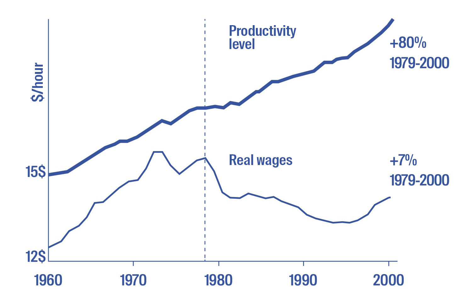 Real wages and productivity in the United States 1960-2000, US Economic Policy Institute. But if we look closely, we can notice this break between productivity and compensation, which is the wage of the workers — how much you produce, how quickly you work, in relation to how much you get paid. During the seventies, the advent of neoliberalism split this connection, dissociating it from the influence of labour unions. A lot of production was moved to low wage countries, which made it more difficult for unions to make a claim to get better pay. Since then, wages have plateaued. To illustrate this point, consider an anecdotal example: in my parents’ generation, a single income could sustain a household comprising four children and two adults. Today, such a scenario is nearly impossible. Now, even in a city like Amsterdam, a household typically requires the income of both partners, often necessitating two high-paying jobs to afford a house. We produce more and more, but we get paid less and less. It’s also worth noting that minimum wage struggles to keep pace with inflation, and this trend raises the question: Where is the value generated by our diligent efforts going? Indeed, designers are among the most hard-worker professionals I’ve encountered. Then why do we get paid less and less? This is another graph which illustrates the comparison between the share income of the top 10% of people, compared to the uninon memberships which are falling.
 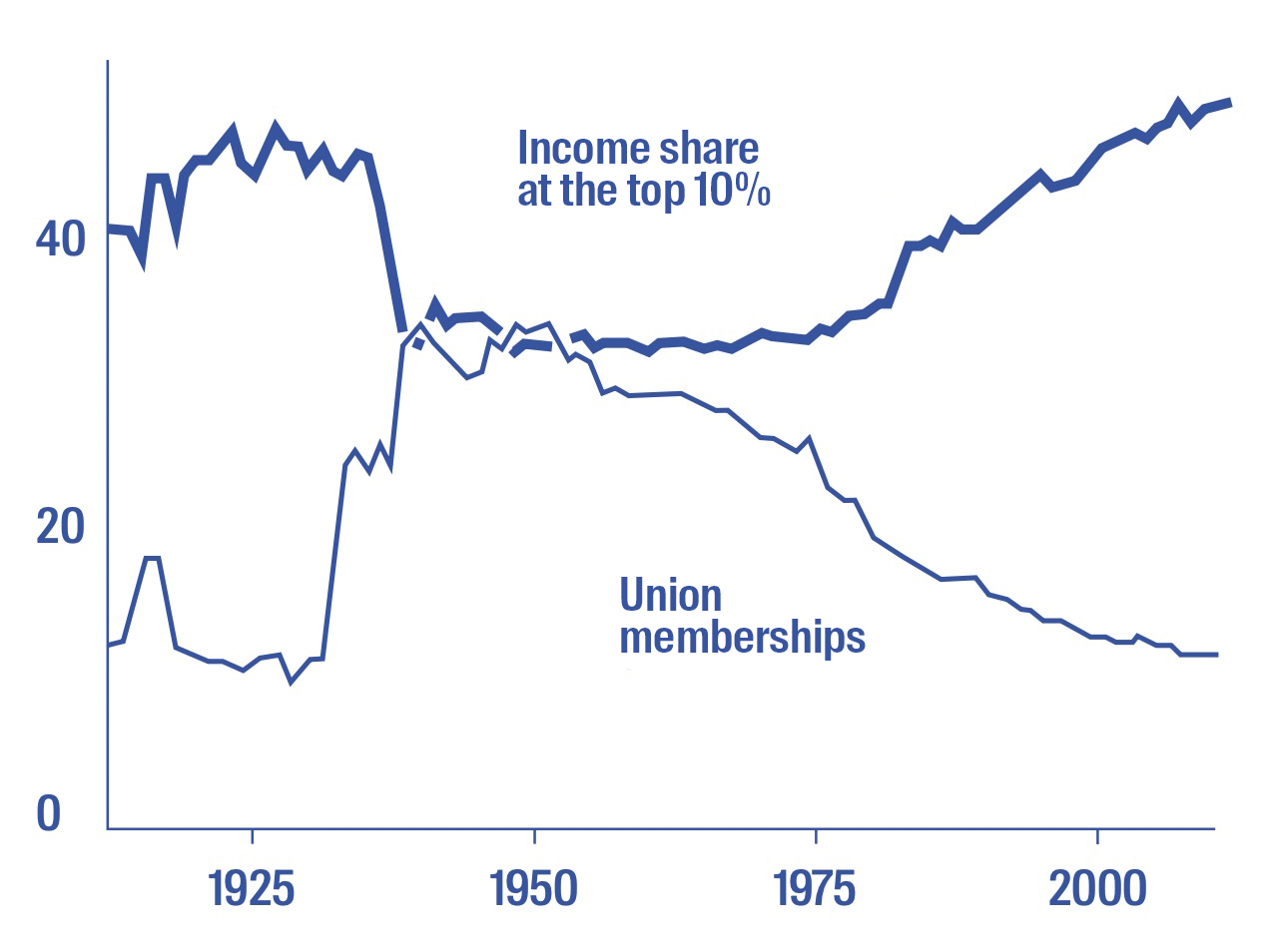 Income share at the top 10% of the population compared to union membership, 1917-2015, U.S. Economic Policy Institute. This example is from the US, but describes global processes: the rising inequality is a direct result of this discrepancy between people. A very small percentage of rich people get increasingly more and more wealth; and at the same time most people get paid less and less compared to what they add to society — that is also linked to disparities in access to information.
It’s essential to consider the disparity in the access to information, a point emphasised also by the sociologist Manuel Castells. While Europe enjoys relatively high internet speeds, there are countries where even loading a text page can be a challenge. Internet access is not equitable worldwide. When designing websites or apps, as designers we often overlook the fact that people may have poor internet connections or no access to fast data connections. Despite the increasing prevalence of these technologies, they are far from being universally accessible. As of 2021, internet users comprise only 60% of the global population. The assumption that everyone has internet access or a smartphone is not accurate.
In the last part of the book, I talk about some of the strategies that designers have come up with in critiquing capitalism. Historically, graphic designers, since the “beginning” with William Morris, have often expressed their discontent with capitalism. Most graphic designers don’t aspire to create products or generate demand for them through advertising. While many designers may engage in such practices out of necessity, their genuine desire is to design something that has both social significance and aesthetic beauty.
Within the design profession, we’ve witnessed the emergence of concepts such as social design and speculative design. These ideas aim to shift the role of design away from serving the market and towards addressing social concerns. In the book, I use the term “philanthropy” to describe this approach, as it traces its roots back to colonialism, where Europeans used the pretence of improving lives to justify their exploitation of other cultures. This concept echoes the historical “white man’s burden”, coined by the writer Rudyard Kipling in the UK, which justified the exploitation and suffering inflicted during colonialism. It sustained the position that Europeans were bringing religion, education, and their “better culture” to “barbaric” lands.
The influence of this white saviour complex can still be observed in certain aspects of social design. Philanthropy today could also be considered as, for instance, the Chan Zuckerberg Foundation by Mark Zuckerberg and his wife. Many Silicon Valley billionaires, aiming to evade taxes, think that they are better equipped to solve global issues than governments. Figures like Peter Thiel (ndr. co-fondatore di PayPal) and Elon Musk regularly remind us of this perspective. Mark Zuckerberg made the audacious promise of eradicating all the world’s diseases within approximately two decades: this is a bit unusual to hear from somebody who’s a tech entrepreneur and not a medical professional. Moreover, there are existing institutions dedicated to such problems — universities and hospitals — that rely on funding, often from taxpayers. However, Facebook, while avoiding tax payments, seeks to establish philanthropic initiatives for these purposes. It’s worth noting that philanthropy, in this case, can also serve as a tax evasion strategy, as it provides a means to hide money and evade taxation.
Throughout history, there have been analyses of a concept suggesting that rich people are inherently superior than poor people, which often leads to the belief that the wealthy deserve their privileged status. This concept implies that somebody who’s homeless has no rights and is morally despicable, and instead somebody who’s very wealthy is morally better and, accordingly, in a different hierarchical position — it perpetuates the same power structure.
To illustrate this point, let’s consider the What design can do. Refugee Challenge initiative from 2014, where we can see this power relation really clearly. I want to clarify that I’m not suggesting that all instances of social design or social design as a whole exhibit this power dynamic. However, it does appear in some instances where individuals from the Global North design solutions for those in the Global South or where privileged individuals design for the underprivileged, even on a local scale. What design can do was a social design festival held in the Netherlands. They decided to create a design challenge to focus on the incoming flow of Syrian refugees. They focus on what they think of as the refugee crisis — which is in itself problematic — with very good intentions: they suggest that we, as designers, should worry about the issues in the world. They also suggest that Governments are not doing enough and we can do something instead. What they proceeded to do was to formulate design briefs: they tasked themselves with creating solutions such as “an app to facilitate the integration of refugees into European society”, devising “architectural approaches tailored to refugee needs”, and “developing social campaigns aimed at fostering improved relations with refugees”. They tried to frame the refugee crisis as a “design problem”, addressing it primarily from a design perspective. What remained unexplored, however, was the broader socio-political context. Notably absent from the discussion were critical considerations such as the active involvement of European countries in Syria during those years, including military operations — simultaneously, Dutch F-16s were engaged in airstrikes in Syria. Moreover, little attention was paid to historical factors like the post-World War I division of the Middle East by European powers or significant events like the Gulf War and military interventions driven by oil interests. These examples represent just a fraction of the complex geopolitical backdrop that needed deeper examination.
What you see is that if we disconnect design and isolate it from its social and political context, we create just “problematic solutions”. In the case of the What Design Can Do. Refugee Challenge, more than 600 designers contributed their work, with the winners receiving 10.000 euros to further develop their projects. One of the nominees was an architect from the US who believed it was better to combine the refugee employment with desertification in Southern Europe, particularly in Italy, Greece, and Spain. He wanted refugees to work in these “deserts” to make them arable again and, when the soil would be arable again, they would give it to European farmers. This raises several critical questions. First of all, we must consider whether individuals fleeing war zones would willingly choose to work in what essentially amounts to a labour camp in a desert — it sounds like a nightmare. Secondly, even after all the labour, the land doesn’t go to the labourers but to established Europeans, leaving us to question how this improves the lives of refugees. Nonetheless, this project was chosen as one of the best. It can really go wrong as you frame something as a design solution — not only it can be problematic, but it can actually be harmful.
There are some projects that were a bit better, especially in initiatives that aim to facilitate refugees’ access to work. However, these efforts often fail to address the most problematic issues. For instance, why do many refugees risk their lives on dangerous boat journeys to Europe? Instead of allowing them to fly safely, the European Union’s policies effectively force them into dangerous situations. In essence, we tend to perpetuate a violent relationship rather than focusing on creating humane and socially responsible ways to assist people in need. We ask designers to create privatised, commodified solutions that often have nothing to do with helping refugees. It might serve as a way to make people feel better, but it doesn’t address the root problems. In addition, the European Union has already designed its response to the refugee crisis with the establishment of large-scale detention centres and the utilisation of sophisticated technologies, often allocating more resources to keeping refugees out of Europe rather than helping them. Government funding for refugee assistance through design initiatives remains limited in comparison.
Basically, if you don’t address these critical issues, continuing a career in design within this context becomes questionable. It’s important and even beneficial for designers to recognize that design has significant social consequences and plays a distinct social role. Even so, I believe mutual aid offers a more interesting approach. It’s just essentially people helping people, similar to how we assist our neighbours and family. This concept isn’t new — but in mutual aid there’s no power relation. Social design often has a power relation where the person who designs is not the person who needs help, establishing a hierarchy between the designer and the person who needs to be helped through design.
The Black Panther Breakfast Program in the 1970s is an interesting example of mutual aid. Their communities were completely abandoned by the US government, so they decided to set up breakfast programs to help themselves. At the peak of this program, there were 40.000 children being fed every day — and that is, of course, because the US government was not doing anything, but it also shows what you can do as a community, just help each other. I think that, as designers, if we are engaging in social processes, it should always be from a more egalitarian perspective. Otherwise we get into a strange power relation that is very difficult — perhaps even impossible — to navigate.
The book outcome does not give the definitive answer for how to challenge these issues in your work or life. I’m afraid I can’t provide that level of certainty, and I apologise if this might disappoint you. The reason for this is twofold. Firstly, my perspective is grounded in my experiences in the Netherlands, where I have chosen to work exclusively with local clients, avoid specific clients, and seek a social role within my community, which I might not necessarily label as “design”. My perspective is inherently shaped by the context in which I operate. Moreover, even within my city of Amsterdam, differences in privilege, roles, agency, and the tools available to designers exist. These variations extend further to encompass diverse contexts, not only across the Netherlands and Europe but also between regions worldwide. It’s crucial to acknowledge that the privileges, roles, and resources available to designers vary significantly, making universal solutions inappropriate. It’s essential to avoid repeating the mistake of history when people attempted to impose universal solutions.
Instead, we should recognize that effective solutions are inherently local, deeply rooted in their respective contexts. The context in which one operates plays a pivotal role in shaping responses to these complex issues. That said, the reason why I decided to write this book and I still remain an optimist despite sharing pessimistic aspects, is that towards the end of the book I chose to engage with collectives that, in their unique ways, resist the logic of capitalism and challenge the conventional role of the designer. While these examples may not be flawless, they are trying to make a difference. I found it worthwhile to connect with these collectives, learn about their actions, strategies, and approaches. My intention was to showcase that people are actively taking steps, and I encourage you to draw inspiration from their efforts. This engagement with collectives gave me the confidence to conclude the book on a hopeful note, rather than leaving you with a sense of hopelessness. The last chapter, The Designer as Activist, shows some examples with this approach.
It’s important first to acknowledge that designers, also in the past, have attempted to respond to the challenges posed by capitalism and the need for activism. You might be familiar with the concept of “activist branding”. Especially from the nineties, merely displaying controversial images in advertisements was considered a political or activist act, even if the underlying intention was to sell products. Today, we’ve evolved to a point where aesthetics that appear critical are often perceived as a form of activism. Even contemporary movements like Black Lives Matter have been associated with brand activism. It’s crucial to approach this with a critical perspective. For instance, while it’s great that Nike supports figures like Colin Kaepernick, a prominent voice in the Black Lives Matter movement, it’s essential to recognize that big companies like Nike make such decisions based on calculations of profit, not in order to change the political landscape. Nike’s support for Kaepernick was a calculated move that resulted in increased sales. We can see a lot with greenwashing, causewashing, and pinkwashing. Companies use designers to create the appearance of being more politically, queer, or environmentally friendly without changing anything in their operations. It’s easier for companies to change their logos or posters rather than transform their core practices, and it’s also easy for companies to invite designers to create that role. As designers who shape brand perception and services, we need to look at these practices critically.
We often confuse the political impact of graphic design with the aesthetics of the work. The focus is not about the aesthetics; such as the use of certain types of typography or specific colours, as these elements just skim the surface. Coming back to the concept of creating services that sell, what remains unexplored is how we address issues like fair compensation for our work, how our clients treat their employees, and how we engage with our local communities. Are we working just for money, for fame, or for a deeper commitment to a social context? What I learned from talking to these collectives is that their impact is rather social than aesthetic. That might not be the kind of design that gets many likes or attention in the press, but ultimately, in the long term, it offers a more profound and meaningful example of design’s potential influence.
Take, for instance, Cooperativa de Diseño from Argentina.
Income share at the top 10% of the population compared to union membership, 1917-2015, U.S. Economic Policy Institute. This example is from the US, but describes global processes: the rising inequality is a direct result of this discrepancy between people. A very small percentage of rich people get increasingly more and more wealth; and at the same time most people get paid less and less compared to what they add to society — that is also linked to disparities in access to information.
It’s essential to consider the disparity in the access to information, a point emphasised also by the sociologist Manuel Castells. While Europe enjoys relatively high internet speeds, there are countries where even loading a text page can be a challenge. Internet access is not equitable worldwide. When designing websites or apps, as designers we often overlook the fact that people may have poor internet connections or no access to fast data connections. Despite the increasing prevalence of these technologies, they are far from being universally accessible. As of 2021, internet users comprise only 60% of the global population. The assumption that everyone has internet access or a smartphone is not accurate.
In the last part of the book, I talk about some of the strategies that designers have come up with in critiquing capitalism. Historically, graphic designers, since the “beginning” with William Morris, have often expressed their discontent with capitalism. Most graphic designers don’t aspire to create products or generate demand for them through advertising. While many designers may engage in such practices out of necessity, their genuine desire is to design something that has both social significance and aesthetic beauty.
Within the design profession, we’ve witnessed the emergence of concepts such as social design and speculative design. These ideas aim to shift the role of design away from serving the market and towards addressing social concerns. In the book, I use the term “philanthropy” to describe this approach, as it traces its roots back to colonialism, where Europeans used the pretence of improving lives to justify their exploitation of other cultures. This concept echoes the historical “white man’s burden”, coined by the writer Rudyard Kipling in the UK, which justified the exploitation and suffering inflicted during colonialism. It sustained the position that Europeans were bringing religion, education, and their “better culture” to “barbaric” lands.
The influence of this white saviour complex can still be observed in certain aspects of social design. Philanthropy today could also be considered as, for instance, the Chan Zuckerberg Foundation by Mark Zuckerberg and his wife. Many Silicon Valley billionaires, aiming to evade taxes, think that they are better equipped to solve global issues than governments. Figures like Peter Thiel (ndr. co-fondatore di PayPal) and Elon Musk regularly remind us of this perspective. Mark Zuckerberg made the audacious promise of eradicating all the world’s diseases within approximately two decades: this is a bit unusual to hear from somebody who’s a tech entrepreneur and not a medical professional. Moreover, there are existing institutions dedicated to such problems — universities and hospitals — that rely on funding, often from taxpayers. However, Facebook, while avoiding tax payments, seeks to establish philanthropic initiatives for these purposes. It’s worth noting that philanthropy, in this case, can also serve as a tax evasion strategy, as it provides a means to hide money and evade taxation.
Throughout history, there have been analyses of a concept suggesting that rich people are inherently superior than poor people, which often leads to the belief that the wealthy deserve their privileged status. This concept implies that somebody who’s homeless has no rights and is morally despicable, and instead somebody who’s very wealthy is morally better and, accordingly, in a different hierarchical position — it perpetuates the same power structure.
To illustrate this point, let’s consider the What design can do. Refugee Challenge initiative from 2014, where we can see this power relation really clearly. I want to clarify that I’m not suggesting that all instances of social design or social design as a whole exhibit this power dynamic. However, it does appear in some instances where individuals from the Global North design solutions for those in the Global South or where privileged individuals design for the underprivileged, even on a local scale. What design can do was a social design festival held in the Netherlands. They decided to create a design challenge to focus on the incoming flow of Syrian refugees. They focus on what they think of as the refugee crisis — which is in itself problematic — with very good intentions: they suggest that we, as designers, should worry about the issues in the world. They also suggest that Governments are not doing enough and we can do something instead. What they proceeded to do was to formulate design briefs: they tasked themselves with creating solutions such as “an app to facilitate the integration of refugees into European society”, devising “architectural approaches tailored to refugee needs”, and “developing social campaigns aimed at fostering improved relations with refugees”. They tried to frame the refugee crisis as a “design problem”, addressing it primarily from a design perspective. What remained unexplored, however, was the broader socio-political context. Notably absent from the discussion were critical considerations such as the active involvement of European countries in Syria during those years, including military operations — simultaneously, Dutch F-16s were engaged in airstrikes in Syria. Moreover, little attention was paid to historical factors like the post-World War I division of the Middle East by European powers or significant events like the Gulf War and military interventions driven by oil interests. These examples represent just a fraction of the complex geopolitical backdrop that needed deeper examination.
What you see is that if we disconnect design and isolate it from its social and political context, we create just “problematic solutions”. In the case of the What Design Can Do. Refugee Challenge, more than 600 designers contributed their work, with the winners receiving 10.000 euros to further develop their projects. One of the nominees was an architect from the US who believed it was better to combine the refugee employment with desertification in Southern Europe, particularly in Italy, Greece, and Spain. He wanted refugees to work in these “deserts” to make them arable again and, when the soil would be arable again, they would give it to European farmers. This raises several critical questions. First of all, we must consider whether individuals fleeing war zones would willingly choose to work in what essentially amounts to a labour camp in a desert — it sounds like a nightmare. Secondly, even after all the labour, the land doesn’t go to the labourers but to established Europeans, leaving us to question how this improves the lives of refugees. Nonetheless, this project was chosen as one of the best. It can really go wrong as you frame something as a design solution — not only it can be problematic, but it can actually be harmful.
There are some projects that were a bit better, especially in initiatives that aim to facilitate refugees’ access to work. However, these efforts often fail to address the most problematic issues. For instance, why do many refugees risk their lives on dangerous boat journeys to Europe? Instead of allowing them to fly safely, the European Union’s policies effectively force them into dangerous situations. In essence, we tend to perpetuate a violent relationship rather than focusing on creating humane and socially responsible ways to assist people in need. We ask designers to create privatised, commodified solutions that often have nothing to do with helping refugees. It might serve as a way to make people feel better, but it doesn’t address the root problems. In addition, the European Union has already designed its response to the refugee crisis with the establishment of large-scale detention centres and the utilisation of sophisticated technologies, often allocating more resources to keeping refugees out of Europe rather than helping them. Government funding for refugee assistance through design initiatives remains limited in comparison.
Basically, if you don’t address these critical issues, continuing a career in design within this context becomes questionable. It’s important and even beneficial for designers to recognize that design has significant social consequences and plays a distinct social role. Even so, I believe mutual aid offers a more interesting approach. It’s just essentially people helping people, similar to how we assist our neighbours and family. This concept isn’t new — but in mutual aid there’s no power relation. Social design often has a power relation where the person who designs is not the person who needs help, establishing a hierarchy between the designer and the person who needs to be helped through design.
The Black Panther Breakfast Program in the 1970s is an interesting example of mutual aid. Their communities were completely abandoned by the US government, so they decided to set up breakfast programs to help themselves. At the peak of this program, there were 40.000 children being fed every day — and that is, of course, because the US government was not doing anything, but it also shows what you can do as a community, just help each other. I think that, as designers, if we are engaging in social processes, it should always be from a more egalitarian perspective. Otherwise we get into a strange power relation that is very difficult — perhaps even impossible — to navigate.
The book outcome does not give the definitive answer for how to challenge these issues in your work or life. I’m afraid I can’t provide that level of certainty, and I apologise if this might disappoint you. The reason for this is twofold. Firstly, my perspective is grounded in my experiences in the Netherlands, where I have chosen to work exclusively with local clients, avoid specific clients, and seek a social role within my community, which I might not necessarily label as “design”. My perspective is inherently shaped by the context in which I operate. Moreover, even within my city of Amsterdam, differences in privilege, roles, agency, and the tools available to designers exist. These variations extend further to encompass diverse contexts, not only across the Netherlands and Europe but also between regions worldwide. It’s crucial to acknowledge that the privileges, roles, and resources available to designers vary significantly, making universal solutions inappropriate. It’s essential to avoid repeating the mistake of history when people attempted to impose universal solutions.
Instead, we should recognize that effective solutions are inherently local, deeply rooted in their respective contexts. The context in which one operates plays a pivotal role in shaping responses to these complex issues. That said, the reason why I decided to write this book and I still remain an optimist despite sharing pessimistic aspects, is that towards the end of the book I chose to engage with collectives that, in their unique ways, resist the logic of capitalism and challenge the conventional role of the designer. While these examples may not be flawless, they are trying to make a difference. I found it worthwhile to connect with these collectives, learn about their actions, strategies, and approaches. My intention was to showcase that people are actively taking steps, and I encourage you to draw inspiration from their efforts. This engagement with collectives gave me the confidence to conclude the book on a hopeful note, rather than leaving you with a sense of hopelessness. The last chapter, The Designer as Activist, shows some examples with this approach.
It’s important first to acknowledge that designers, also in the past, have attempted to respond to the challenges posed by capitalism and the need for activism. You might be familiar with the concept of “activist branding”. Especially from the nineties, merely displaying controversial images in advertisements was considered a political or activist act, even if the underlying intention was to sell products. Today, we’ve evolved to a point where aesthetics that appear critical are often perceived as a form of activism. Even contemporary movements like Black Lives Matter have been associated with brand activism. It’s crucial to approach this with a critical perspective. For instance, while it’s great that Nike supports figures like Colin Kaepernick, a prominent voice in the Black Lives Matter movement, it’s essential to recognize that big companies like Nike make such decisions based on calculations of profit, not in order to change the political landscape. Nike’s support for Kaepernick was a calculated move that resulted in increased sales. We can see a lot with greenwashing, causewashing, and pinkwashing. Companies use designers to create the appearance of being more politically, queer, or environmentally friendly without changing anything in their operations. It’s easier for companies to change their logos or posters rather than transform their core practices, and it’s also easy for companies to invite designers to create that role. As designers who shape brand perception and services, we need to look at these practices critically.
We often confuse the political impact of graphic design with the aesthetics of the work. The focus is not about the aesthetics; such as the use of certain types of typography or specific colours, as these elements just skim the surface. Coming back to the concept of creating services that sell, what remains unexplored is how we address issues like fair compensation for our work, how our clients treat their employees, and how we engage with our local communities. Are we working just for money, for fame, or for a deeper commitment to a social context? What I learned from talking to these collectives is that their impact is rather social than aesthetic. That might not be the kind of design that gets many likes or attention in the press, but ultimately, in the long term, it offers a more profound and meaningful example of design’s potential influence.
Take, for instance, Cooperativa de Diseño from Argentina. 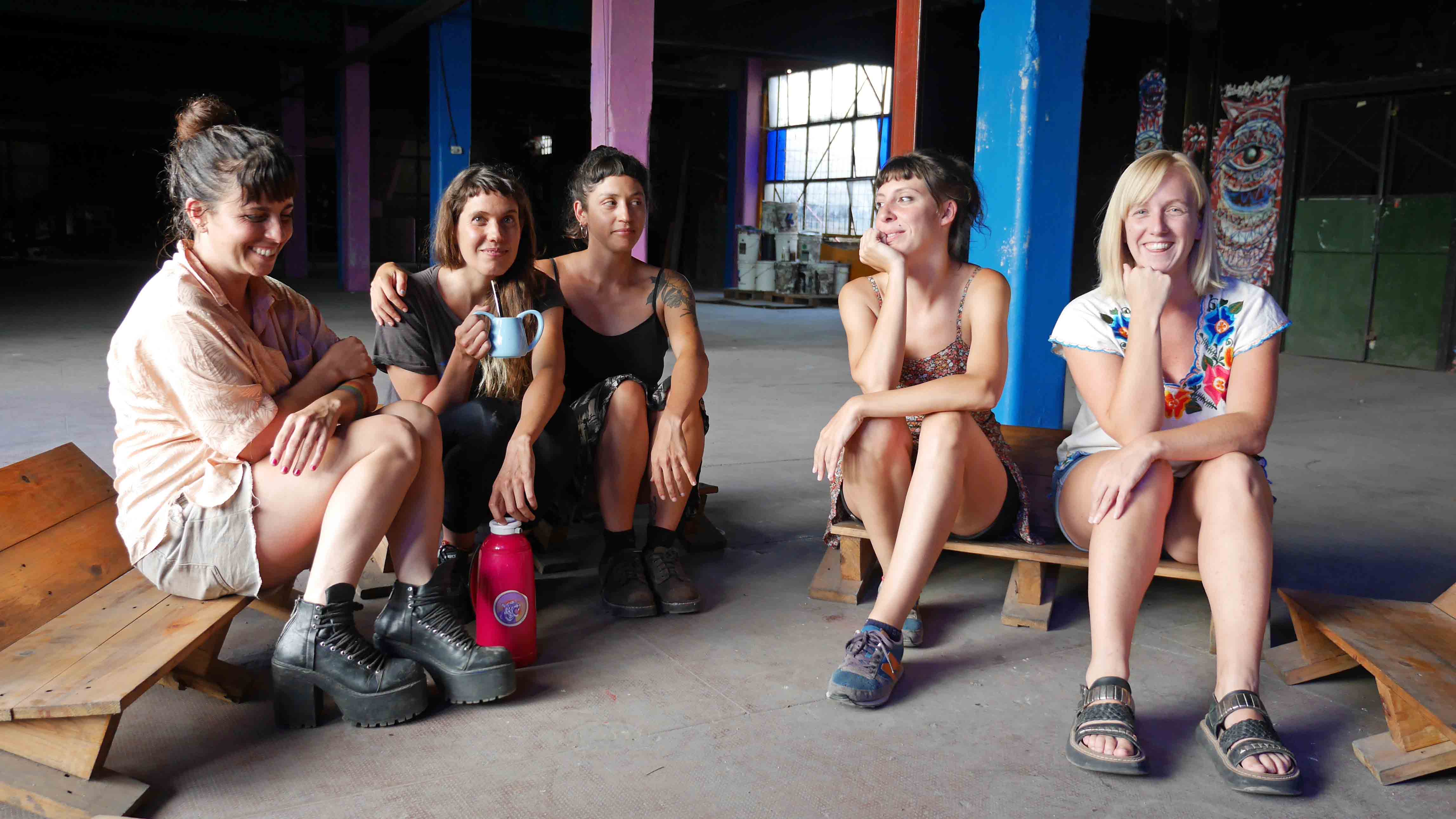 The founders of the Cooperativa de Diseño. I believe it’s essential to draw examples not exclusively from Europe or the United States, and I’ve discovered numerous compelling initiatives in Latin America. Cooperativa de Diseño is a feminist collective that actively engages in creating work for protests and the pro-abortion movement in Argentina, and they also are product designers. One particular aspect is their partnership with a collectivised factory dating back to the nineties. This factory is owned by the workers and, together, they craft various metal objects. Their collaboration goes beyond activist action with government funding; they’ve managed to sustain themselves independently. What sets them apart is their feminist perspective, which strongly influences their practice — they delve into topics like parental leave, for instance, and many other situations in relation to their work. A cooperative is basically a way to run a business without bosses. Today we are used to a work environment where there is one boss that gets paid the most, there’s a senior designer, junior designer, and often an intern that gets nothing. In this case, the perspective is totally different. Compensation is based on the time each member invests in the cooperative, avoiding hierarchical pay structures. However, this model necessitates comprehensive discussions and decision-making, which can sometimes involve much time on matters like choosing the colour to paint the studio walls. Nevertheless, it’s intriguing as it allows for experimentation with alternative forms of collaboration and work. Let’s imagine, what if you work at a design studio and you are involved in every decision, even the bookkeeping? In that case we can realise that our impact as designers is not just aesthetic and in our work, but also in the way that we behave as economic actors. Where do we buy our lunch? What restaurants do we go to? What’s our printer? How do we pay our interns? How do we deal with parental leave? All of these things are part of a design studio.
Another example is Open Source Publishing based in Brussels.
The founders of the Cooperativa de Diseño. I believe it’s essential to draw examples not exclusively from Europe or the United States, and I’ve discovered numerous compelling initiatives in Latin America. Cooperativa de Diseño is a feminist collective that actively engages in creating work for protests and the pro-abortion movement in Argentina, and they also are product designers. One particular aspect is their partnership with a collectivised factory dating back to the nineties. This factory is owned by the workers and, together, they craft various metal objects. Their collaboration goes beyond activist action with government funding; they’ve managed to sustain themselves independently. What sets them apart is their feminist perspective, which strongly influences their practice — they delve into topics like parental leave, for instance, and many other situations in relation to their work. A cooperative is basically a way to run a business without bosses. Today we are used to a work environment where there is one boss that gets paid the most, there’s a senior designer, junior designer, and often an intern that gets nothing. In this case, the perspective is totally different. Compensation is based on the time each member invests in the cooperative, avoiding hierarchical pay structures. However, this model necessitates comprehensive discussions and decision-making, which can sometimes involve much time on matters like choosing the colour to paint the studio walls. Nevertheless, it’s intriguing as it allows for experimentation with alternative forms of collaboration and work. Let’s imagine, what if you work at a design studio and you are involved in every decision, even the bookkeeping? In that case we can realise that our impact as designers is not just aesthetic and in our work, but also in the way that we behave as economic actors. Where do we buy our lunch? What restaurants do we go to? What’s our printer? How do we pay our interns? How do we deal with parental leave? All of these things are part of a design studio.
Another example is Open Source Publishing based in Brussels. 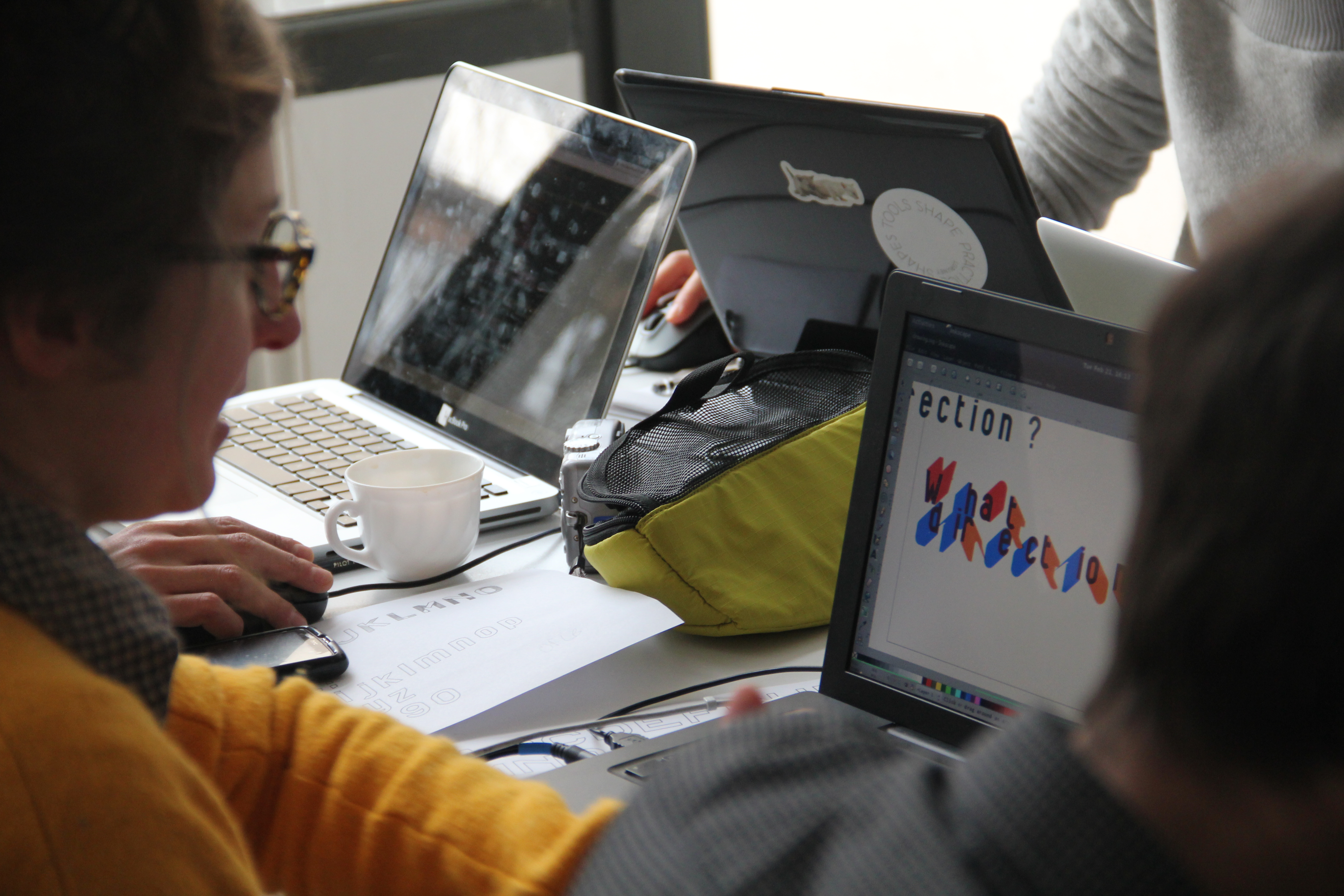 A workshop with Open Source Publishing. While they do receive some funding, it’s important to note that this studio doesn’t prioritise financial gain. In fact, all the individuals involved have other jobs alongside their work here. What truly is interesting is their commitment to open source software, held over the past 15 years. They’ve avoided proprietary systems like Mac OS and Adobe, because they believe that culture is created collectively. After all, why would we use copyright when we perpetually stand on the shoulders of those who preceded us?
To really practise that, they have adopted strategies from software development. They put the sketches of every project online for free, so everybody can download, use and reuse them as long as they credit. For instance, they designed many typefaces and put all the documentation: you can download all the typefaces, use them, rework them. What’s intriguing is their ongoing experimentation with various forms of culture, intellectual property, and cultural ownership. They’ve embraced the copyleft philosophy, going beyond the conventions of Creative Commons, to challenge the notions of value and ownership in their personal radical way. While they may not have found the perfect model yet, the fact that they’ve been at it for years is exceptionally notable. We can discover valuable insights from their practices, as they show many remarkable projects and extensive documentation on their website.
An additional instance is Brave New Alps.
A workshop with Open Source Publishing. While they do receive some funding, it’s important to note that this studio doesn’t prioritise financial gain. In fact, all the individuals involved have other jobs alongside their work here. What truly is interesting is their commitment to open source software, held over the past 15 years. They’ve avoided proprietary systems like Mac OS and Adobe, because they believe that culture is created collectively. After all, why would we use copyright when we perpetually stand on the shoulders of those who preceded us?
To really practise that, they have adopted strategies from software development. They put the sketches of every project online for free, so everybody can download, use and reuse them as long as they credit. For instance, they designed many typefaces and put all the documentation: you can download all the typefaces, use them, rework them. What’s intriguing is their ongoing experimentation with various forms of culture, intellectual property, and cultural ownership. They’ve embraced the copyleft philosophy, going beyond the conventions of Creative Commons, to challenge the notions of value and ownership in their personal radical way. While they may not have found the perfect model yet, the fact that they’ve been at it for years is exceptionally notable. We can discover valuable insights from their practices, as they show many remarkable projects and extensive documentation on their website.
An additional instance is Brave New Alps.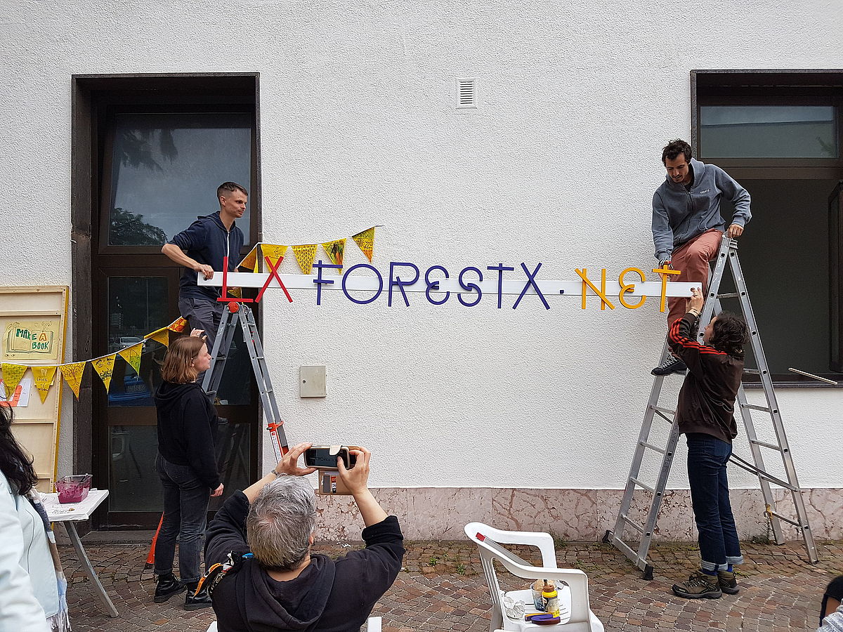 A workshop with Brave New Alps What makes them stand out is their commitment to understanding and adapting to their local context. They are situated in the Bolzano area, in northern Italy, and their approach revolves around aligning themselves not with distant design capitals or big design magazines, but with their immediate environment. Bianca, one of the co-founders, spoke to me about the concept of solidarity economies, emphasising that the dichotomy between capitalism and anti-capitalism doesn’t summarise the complex reality. Real-life situations are often messy. To navigate this complexity, they recognize the importance of resource-sharing in rural areas. For instance, they secured funding for power tools, which are made available for communal use within the local community. That is a very uncommon practice — usually a studio has a relationship with its client and a relationship with other designers, but it’s a closed environment. It does not behave as a sort of community centre or it does not have a role in the community. Embracing this approach is challenging not only because it entails a commitment to staying in one place, precluding the option to simply leave when dissatisfied. That means you have to solve messy, local problems. And then, the work produced may not be considered glamorous and may not find a place of prominence in a portfolio: this implies putting aside the desire for personal fame.
Although they do receive some attention, I’ve encountered many people asking me about how I discovered these lesser-known studios. They are accustomed to hearing about renowned names. Thus, the prevailing image of design focuses on achieving individual recognition, fame, and the pursuit of awards and being in a museum. This narrative encourages designers to seek personal recognition and remembrance rather than recognizing that design always creates a social relation between people. We are communicators — we’re supposed to create objects that mediate communication. Therefore, the social relevance of that communication and how it functions in a broader social context are more crucial to me than simply adopting the label of social designer and attempting to address specific issues. I believe it’s essential to reflect on our existing role and the social contributions we are already making. What social things are you doing already? What is your relationship with your printer? You know, what kind of clients do you work for? How do you relate to the neighbours, to the neighbourhood?
I find this to be a very humble and modest yet incredibly intriguing aspect of design that is often overlooked. When I was researching this part of my book, I had the opportunity to visit Midia Ninja in Brazil.
A workshop with Brave New Alps What makes them stand out is their commitment to understanding and adapting to their local context. They are situated in the Bolzano area, in northern Italy, and their approach revolves around aligning themselves not with distant design capitals or big design magazines, but with their immediate environment. Bianca, one of the co-founders, spoke to me about the concept of solidarity economies, emphasising that the dichotomy between capitalism and anti-capitalism doesn’t summarise the complex reality. Real-life situations are often messy. To navigate this complexity, they recognize the importance of resource-sharing in rural areas. For instance, they secured funding for power tools, which are made available for communal use within the local community. That is a very uncommon practice — usually a studio has a relationship with its client and a relationship with other designers, but it’s a closed environment. It does not behave as a sort of community centre or it does not have a role in the community. Embracing this approach is challenging not only because it entails a commitment to staying in one place, precluding the option to simply leave when dissatisfied. That means you have to solve messy, local problems. And then, the work produced may not be considered glamorous and may not find a place of prominence in a portfolio: this implies putting aside the desire for personal fame.
Although they do receive some attention, I’ve encountered many people asking me about how I discovered these lesser-known studios. They are accustomed to hearing about renowned names. Thus, the prevailing image of design focuses on achieving individual recognition, fame, and the pursuit of awards and being in a museum. This narrative encourages designers to seek personal recognition and remembrance rather than recognizing that design always creates a social relation between people. We are communicators — we’re supposed to create objects that mediate communication. Therefore, the social relevance of that communication and how it functions in a broader social context are more crucial to me than simply adopting the label of social designer and attempting to address specific issues. I believe it’s essential to reflect on our existing role and the social contributions we are already making. What social things are you doing already? What is your relationship with your printer? You know, what kind of clients do you work for? How do you relate to the neighbours, to the neighbourhood?
I find this to be a very humble and modest yet incredibly intriguing aspect of design that is often overlooked. When I was researching this part of my book, I had the opportunity to visit Midia Ninja in Brazil. 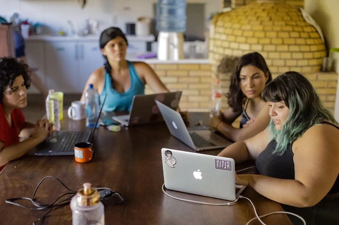 A meeting of Midia Ninjas in the casas colectivas. This collective comprises around 200 people, part of a larger network of 2000 individuals. They are a group of activists and media advocates who also organise concerts and festivals, all with a strong political urge. They live in shared casas colectivas or collective houses, where living conditions are very basic — people share clothes and sleep on mattresses. They offer themselves no luxury, working collectively on significant activist initiatives. In the face of Bolsonaro’s presidency in Brazil, they became extremely active, striving to amplify the voices of indigenous groups and collaborate with marginalised communities.
All of their work is open source and freely accessible. They use social media, sharing videos and content. They even have their own currency system, using circles to facilitate transactions. In the book, I showcase their numerous Telegram channels, covering a wide range of topics, from Midia Ninja graphic design, to photography and product design. Many individuals participate in multiple activities and often switch roles. The fact that they don’t get paid was heavily criticised from a US and European perspective. When I asked one of the people from this collective about this, Rafael, he pointed out that they have three meals a day and a roof over their heads: they live a better life than the majority of people in Brazil. While they engage in unpaid labour, they maintain a simple yet fulfilling life within these collectives, where they have a lot of fun and enjoy a high quality of life. Additionally, many individuals volunteer for these roles voluntarily.
This situation underlines the fact that not everyone can be a highly paid designer. This model is not sustainable; this is precisely the point where I started with. It’s clear that we cannot all have well-paying design jobs and comfortable apartments if we aim to ensure a good life for both future generations and the planet. This brings us to a crucial point: what are we willing to sacrifice and what can we sacrifice in terms of our own lifestyles? All these decisions are intertwined in the complex relationship between politics, ecology, and the design profession.
My final example is a group known as The Public, from Canada. They are a group of queer, people of colour and community designers, who established themselves into a Toronto neighbourhood with the intent of introducing community design to combat gentrification. However, they immediately realised that creativity was not exclusive to them; many creative individuals resided in this neighbourhood, some without access to art education. Consequently, they adopted a more facilitative role. They transformed the lower part of their building into a public gallery, showcasing the work of local residents, and they also organise many open workshops.
A meeting of Midia Ninjas in the casas colectivas. This collective comprises around 200 people, part of a larger network of 2000 individuals. They are a group of activists and media advocates who also organise concerts and festivals, all with a strong political urge. They live in shared casas colectivas or collective houses, where living conditions are very basic — people share clothes and sleep on mattresses. They offer themselves no luxury, working collectively on significant activist initiatives. In the face of Bolsonaro’s presidency in Brazil, they became extremely active, striving to amplify the voices of indigenous groups and collaborate with marginalised communities.
All of their work is open source and freely accessible. They use social media, sharing videos and content. They even have their own currency system, using circles to facilitate transactions. In the book, I showcase their numerous Telegram channels, covering a wide range of topics, from Midia Ninja graphic design, to photography and product design. Many individuals participate in multiple activities and often switch roles. The fact that they don’t get paid was heavily criticised from a US and European perspective. When I asked one of the people from this collective about this, Rafael, he pointed out that they have three meals a day and a roof over their heads: they live a better life than the majority of people in Brazil. While they engage in unpaid labour, they maintain a simple yet fulfilling life within these collectives, where they have a lot of fun and enjoy a high quality of life. Additionally, many individuals volunteer for these roles voluntarily.
This situation underlines the fact that not everyone can be a highly paid designer. This model is not sustainable; this is precisely the point where I started with. It’s clear that we cannot all have well-paying design jobs and comfortable apartments if we aim to ensure a good life for both future generations and the planet. This brings us to a crucial point: what are we willing to sacrifice and what can we sacrifice in terms of our own lifestyles? All these decisions are intertwined in the complex relationship between politics, ecology, and the design profession.
My final example is a group known as The Public, from Canada. They are a group of queer, people of colour and community designers, who established themselves into a Toronto neighbourhood with the intent of introducing community design to combat gentrification. However, they immediately realised that creativity was not exclusive to them; many creative individuals resided in this neighbourhood, some without access to art education. Consequently, they adopted a more facilitative role. They transformed the lower part of their building into a public gallery, showcasing the work of local residents, and they also organise many open workshops. 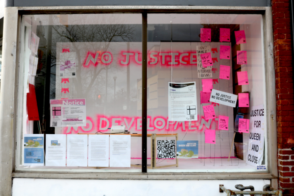 The gallery of The Public.
 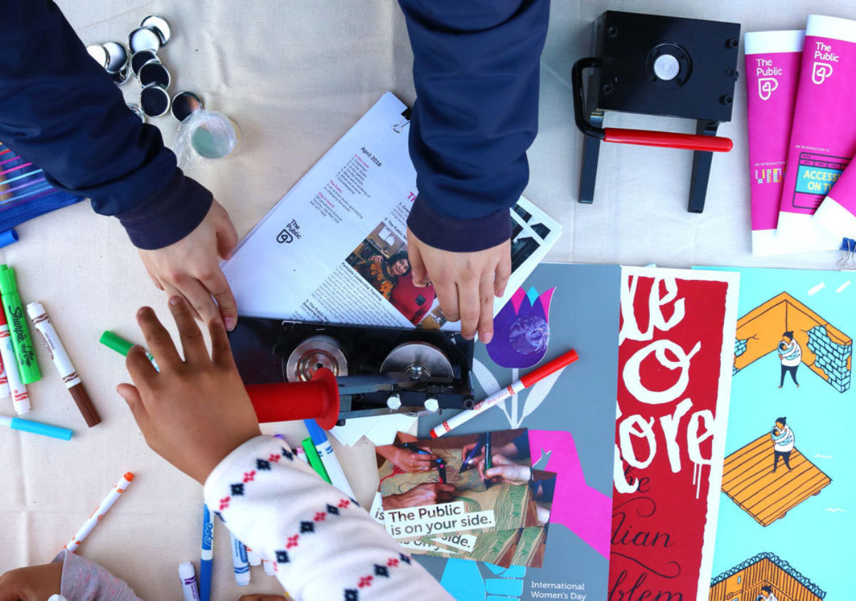 A workshop with The Public. Aesthetically, their work may not garner awards, and they may not be the most renowned Canadian design collective, but their intersectional approach is fascinating. They focus on empowering marginalised people in their neighbourhood, strengthening their voices in community activism, which is often controlled by a select few. Their efforts extend to areas such as food cooperatives and anti-gentrification actions, as this neighbourhood grapples with the pressures of gentrification. When I inquired about their long-term commitment, they affirmed their dedication to staying in the community, rejecting the idea of inflating property values and departing. Instead, they pledged to remain and be an integral part of the community — a courageous and commendable commitment.
This prompts designers to contemplate unique questions compared to the traditional approach of feeling detached from the local context, crafting aesthetically pleasing work for magazines and various international clients, and leading a nomadic professional life. These ideas left a profound impact on me, and they offer a fresh perspective on design.
A workshop with The Public. Aesthetically, their work may not garner awards, and they may not be the most renowned Canadian design collective, but their intersectional approach is fascinating. They focus on empowering marginalised people in their neighbourhood, strengthening their voices in community activism, which is often controlled by a select few. Their efforts extend to areas such as food cooperatives and anti-gentrification actions, as this neighbourhood grapples with the pressures of gentrification. When I inquired about their long-term commitment, they affirmed their dedication to staying in the community, rejecting the idea of inflating property values and departing. Instead, they pledged to remain and be an integral part of the community — a courageous and commendable commitment.
This prompts designers to contemplate unique questions compared to the traditional approach of feeling detached from the local context, crafting aesthetically pleasing work for magazines and various international clients, and leading a nomadic professional life. These ideas left a profound impact on me, and they offer a fresh perspective on design.